The interplay of color design and human emotion has long fascinated architects, landscape designers, and psychologists. As outdoor spaces evolve into extensions of our interior habitats, harnessing the psychological power of color in exterior environments has become a cornerstone of modern outdoor palettes. But how do the hues we select shape perception, encourage engagement, and subtly direct experience in gardens, terraces, rooftops, and luxury real estate developments worldwide? In this exploration, we delve into the sophisticated artistry and nuanced science of outdoor color psychology, uncovering how leading designers utilize color to craft atmospheres that linger in memory and uplift the soul.
The Science Behind Color Perception in Outdoor Design
Color is not merely an aesthetic choice; it’s a sensory language that our brains interpret in milliseconds. Physiologically, color wavelengths interact with the eye’s cones and rods, triggering both subconscious and emotional responses. Outdoors, this interaction is magnified by ever-changing light, scale, and open vistas. Thus, color design in exterior environments transcends decoration — it orchestrates wellbeing, cognitive function, and even social interaction.
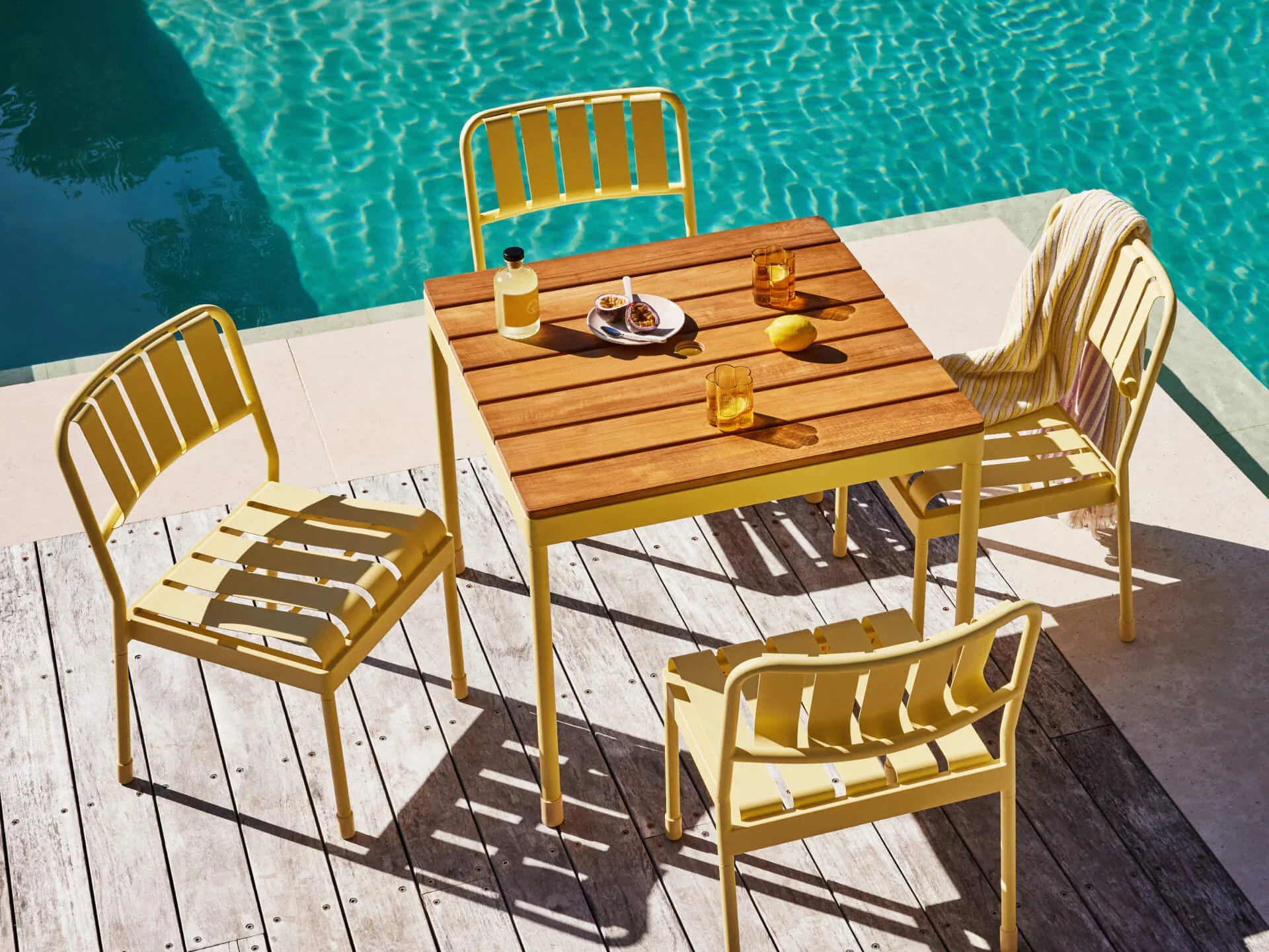
From azure blues calming waterfront resorts to vibrant terracottas enlivening Mediterranean courtyards, modern outdoor palettes are meticulously selected to echo location, context, and desired mood. Designers fluent in color psychology leverage this knowledge to curate unforgettable alfresco experiences.
Color Design Principles: Bridging Nature and Intention
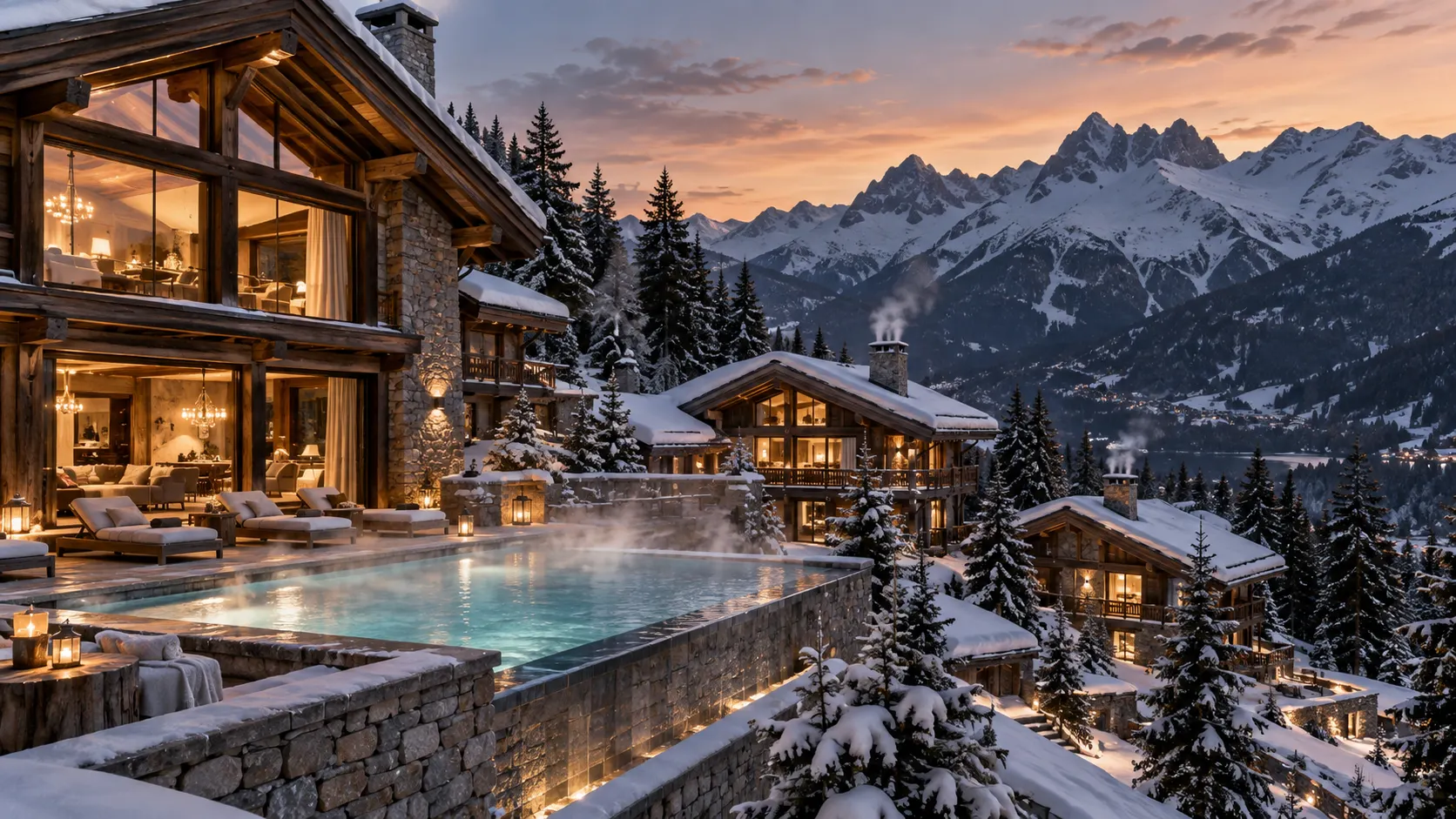
At its highest level, color design outdoors seeks balance between the organic palette of the landscape and the aspirational qualities desired by the client or user. Unlike interiors—bounded and predictably lit—exterior environments demand fluidity and adaptability. The sun, clouds, and seasonal changes all influence how color reads, evolves, and interacts with plantings, stone, water features, or furnishings.
- Contextual Harmony: Integrating hues that resonate with indigenous flora or built heritage.
- Sensory Focus: Using color to draw the eye, quiet the mind, or invite exploration.
- Cultural Resonance: Adapting palettes to reflect regional identities or international influences.
- Temporal Transformation: Embracing how daylight and climate shift the perception of color design throughout the day and year.
The Psychological Impact of Key Hues in Outdoor Palettes
Blues: Tranquility and Blue-Zone Longevity
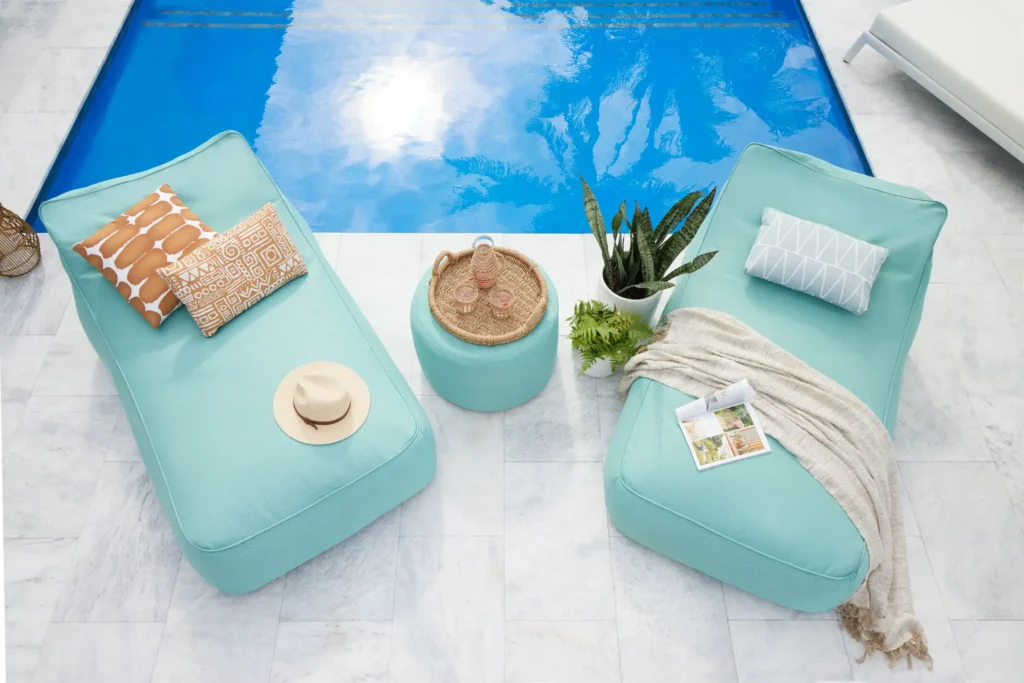
It’s no accident that some of the world’s healthiest, most serene environments—Santorini, the Maldives, Morocco’s Chefchaouen—are awash with blue. Studies in environmental psychology reveal that blue hues reduce heart rates, lower blood pressure, and promote meditative states. Sophisticated terraces and rooftop gardens in luxury real estate often employ pale sky, deep indigo, or aquamarine accents to foster tranquility and distance from urban stress.
Greens: Vitality, Restoration, and Connection
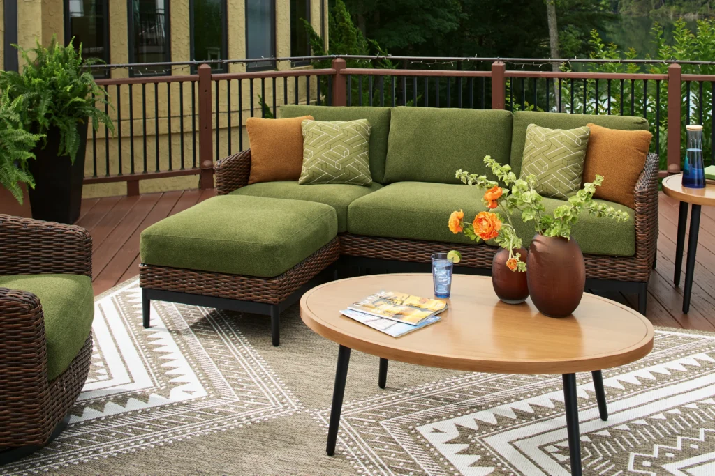
Green, the omnipresent color of nature, is physiologically restful and emotionally restorative. It is also the most visible color to the human eye. In modern outdoor palettes, verdant greens are paired with stone and wood to evoke a sense of sanctuary and primeval connection—an effect amplified through layering tones from tick moss to blue spruce. For designers, a judicious use of green in color design encourages a seamless indoor-outdoor flow essential to contemporary lifestyles.
Neutrals and Earth Tones: Subtle Luxury
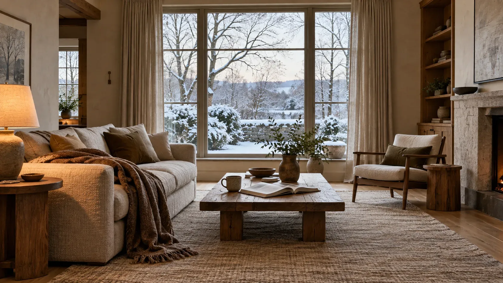
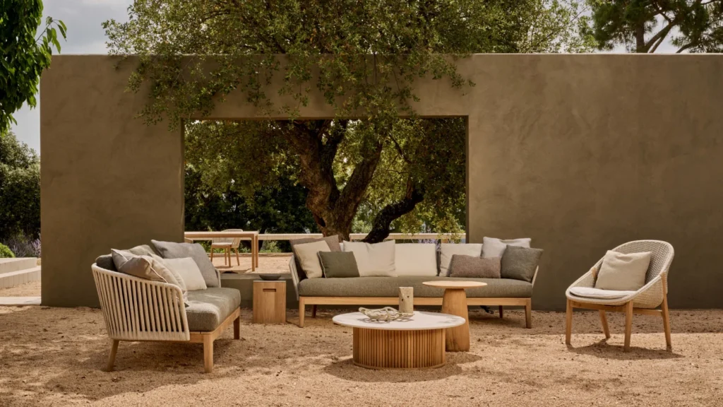
Stone, sand, clay, and taupe are the silent ambassadors of luxury in high-end garden and poolside settings. These natural neutrals offer a sophisticated backdrop, allowing botanical colors or architectural elements to take center stage. They also heighten spatial perception and offer a timelessness that transcends fleeting trends—an essential consideration in both private estates and branded residences.
Warm Hues: Energy, Celebration, and Focal Points
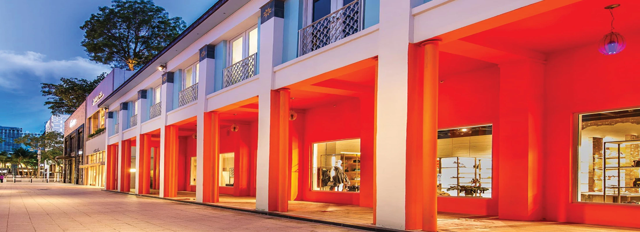
Reds, oranges, and terracottas activate senses, foster social interaction, and create dynamic focal points. In select doses, these hues infuse outdoor spaces with energy and warmth, recalling exotic resorts, earthen amphitheaters, or festive piazzas. Modern outdoor palettes often deploy these colors through artisanal ceramics, statement textiles, or sculptural plantings to punctuate otherwise calm environments.
Modern Outdoor Palettes: Trends and Timelessness
Designers curating outdoor color design in the current era face a delightful paradox: the desire for ecological integration, and the yearning for expressiveness. 2024 sees a convergence of timelessness and innovation, as curated palettes balance environmental consciousness with global sophistication.
- Biophilic Blues and Greens: Inspired by water, sky, and foliage, layered for wellness and immersion.
- Desert Modernism: Sun-washed ochres, gentle pinks, and soft beige tones, referencing the elegance of Palm Springs and Marrakesh.
- Monochromatic Modern: Subtle gradations in a single hue—think all-greys or taupe-on-taupe—providing a serene, sculptural quality to terraces and courtyards.
- Punctuated Color: Neutral bases enlivened by bold, strategic bursts of color—such as a cobalt waterline tile or vermilion planter—catering to contemporary tastes for personalization.
Case Studies: Mastery of Outdoor Color Design
- Villa Euphoria, Côte d’Azur
- Frosted blue infinity pools merge with the Mediterranean horizon, while subtle olive tones in the hardscape echo ancient groves; aquamarine cushions and porcelain mosaic tiles complete the boundary-erasing effect.
- Palo Alto Modernist Retreat
- Sandy aggregate flooring and grey-green succulents create a meditative context. Chartreuse accent tables and persimmon planters energize conversation zones, responding to shifting Californian sunlight.
- Urban Skygarden, Singapore
- Emerald vertical gardens and cerulean water features intertwine with illuminated white seating, reflecting the city’s cosmopolitan vibrancy while softening the skyline’s density.